
UX/UI DESIGN
Centennial Colts Touchscreen TV
User-friendly interface for optimized interaction on a touchscreen TV.
About the project
Summary
My Role
UX/UI Designer
Team
2 UX Researchers
1 Graphic Designer
1 Marketer/Project manager
Company
Centennial Colts Athletics and Recreation
Tools
Figma
Adobe Illustrator
Adobe Photoshop
Miro
Deliverables
Wireframes
Digital prototype
User research & user testing
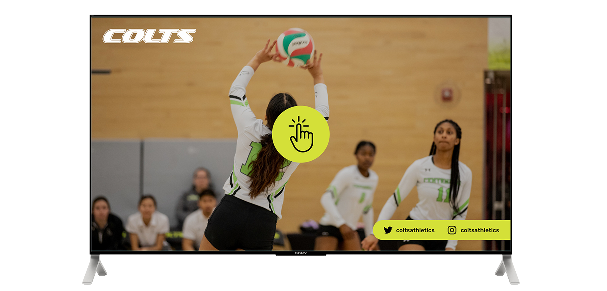
During my part-time work with Centennial College Athletics while enrolled in the Interactive Media Management program, I contributed to a project aimed at creating a user-friendly solution for a large touchscreen display at Progress Campus in Scarborough.
My assigned task involved reviewing all content created by the UX researchers, collaborating with them to enhance their work, contributing to it, and creating an updated version of the wireframes, followed by a digital prototype.
Problem
The marketing team recognized the need to make a touchscreen TV located at the Athletic and Wellness Center functional and informative for students regarding sports and wellness.
- Centennial College has around 26,000 full-time students, with only about 2% participating in sports or wellness activities. The marketing team aims to increase participation in sports teams and use of wellness facilities.
- According with our research, around 55% of students are not fully aware of all offered services.
Opportunity
Being aware of all available services can encourage people to participate in sports and activities, promoting a healthy lifestyle and enhancing personal and academic success.
Our team researched the Centennial College Athletics website to identify gaps that this new display could fill. To increase awareness of the Athletics Centre and Colts Teams, we aimed to create an interactive platform that encourages students to join teams, attend games, and participate in programs.
My goal as a UX/UI designer was to develop a user-friendly and accessible prototype that appeals to all interested in sports and wellness.
My Process
Kickoff Meeting
I began by meeting with the team to understand all the work done, especially the research on users and the Centennial College Athletics website, which served as our guide for the display.
Reading all documentation and discussing the work done
A current analysis on Google Analytics showed the most popular pages of the website, which were then refined to become sessions on the touchscreen: Varsity, Recreation, Become a Colt, Games Calendar, Progress Facilities, and Colts History.
Taking action
Based on the insights gained from analyzing the website and interviews with athletes and students in person, the team developed the first user path illustration to help us visualize users’ actions while navigating the platform.
Understanding the users
Our primary audience consists of full-time and part-time students, with staff as a secondary audience, aged between 22 and 45 years old. They are individuals of any gender or nationality who are interested in sports, wellness activities, and recreational programs.
Google Analytics reports helped us see how users navigate the website, where they’re from, and which pages they visit the most.
User need statement
Meet Tom, a passionate soccer fan who seeks an interactive and up-to-date platform to keep him informed about the upcoming men’s soccer games while on campus. He is eager to support the Colts and stay engaged with the team’s activities.
Personas
Inderpreet – Former basketball and volleyball player
Steve – Basketball player Jonathan – Soccer fan
Ana – Gym enthusiast

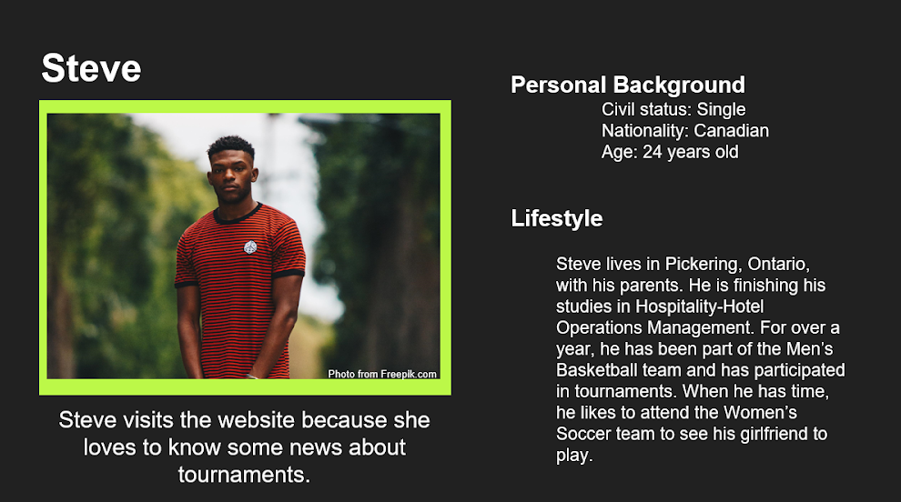
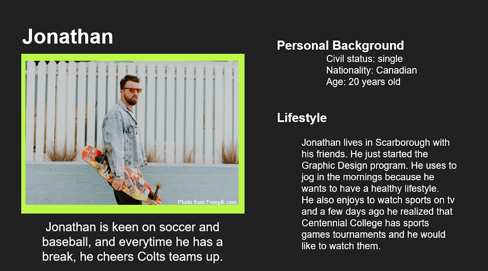
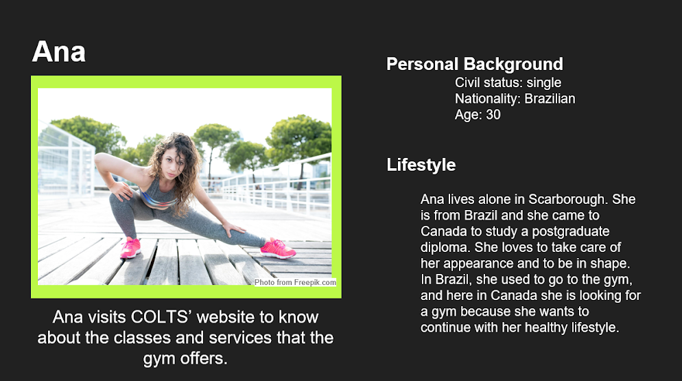
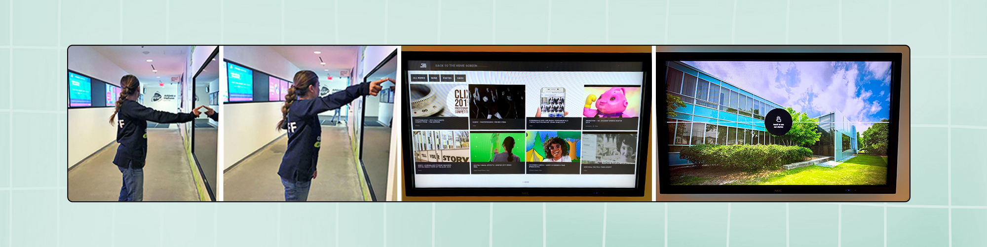
Ensuring everyone could use the touchscreen was important, as people have different physical abilities. For example, a shorter person had trouble reaching the corners of the screen without moving. On the other hand, a basketball player could easily reach all corners of the screen.
To make sure the touchscreen worked for everyone, we tested how easy it was to reach and compared it with another touchscreen on campus.
User Narrative
I created a document with a user narrative for first-time users and included some questions that might arise before and during their interaction with the new display. This help us predict problems.
Scenario
The new touchscreen display is strategically located at Progress Campus, where people are experiencing it for the first time, 24/7. The goal is to encourage interaction, which is why the user interface is appealing. The first-time user experience should be easy and quick, even in a busy area. The touchscreen provides information on health tips, joining a Colts sports team, the schedule for wellness programs, and entertainment such as videos, photos, and games.
Before interacting:
“Is this just a TV? Can I use it for something else?”
“Where should I touch?”
“Can I easily read everything?”
“What options do I have on this screen?”
“That video looks interesting. Can I pause it?”
“Are there pictures from yesterday’s baseball game?”
While interacting:
“What recreational events are happening today?”
“How can I view the basketball game schedule for this month?”
“Where do I tap to see the men’s soccer game schedule?”
“Will I get a prize for completing the Colts history quiz?”
“How can I join the Colts? What do I need to do?”
“What wellness activities are available on Progress Campus?”
Wireframing
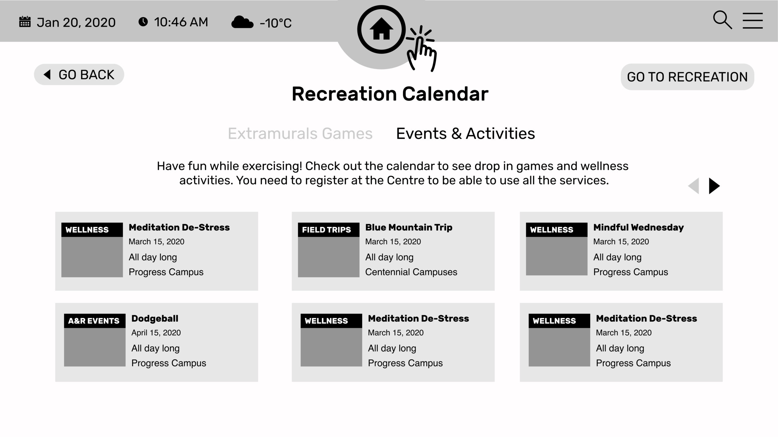
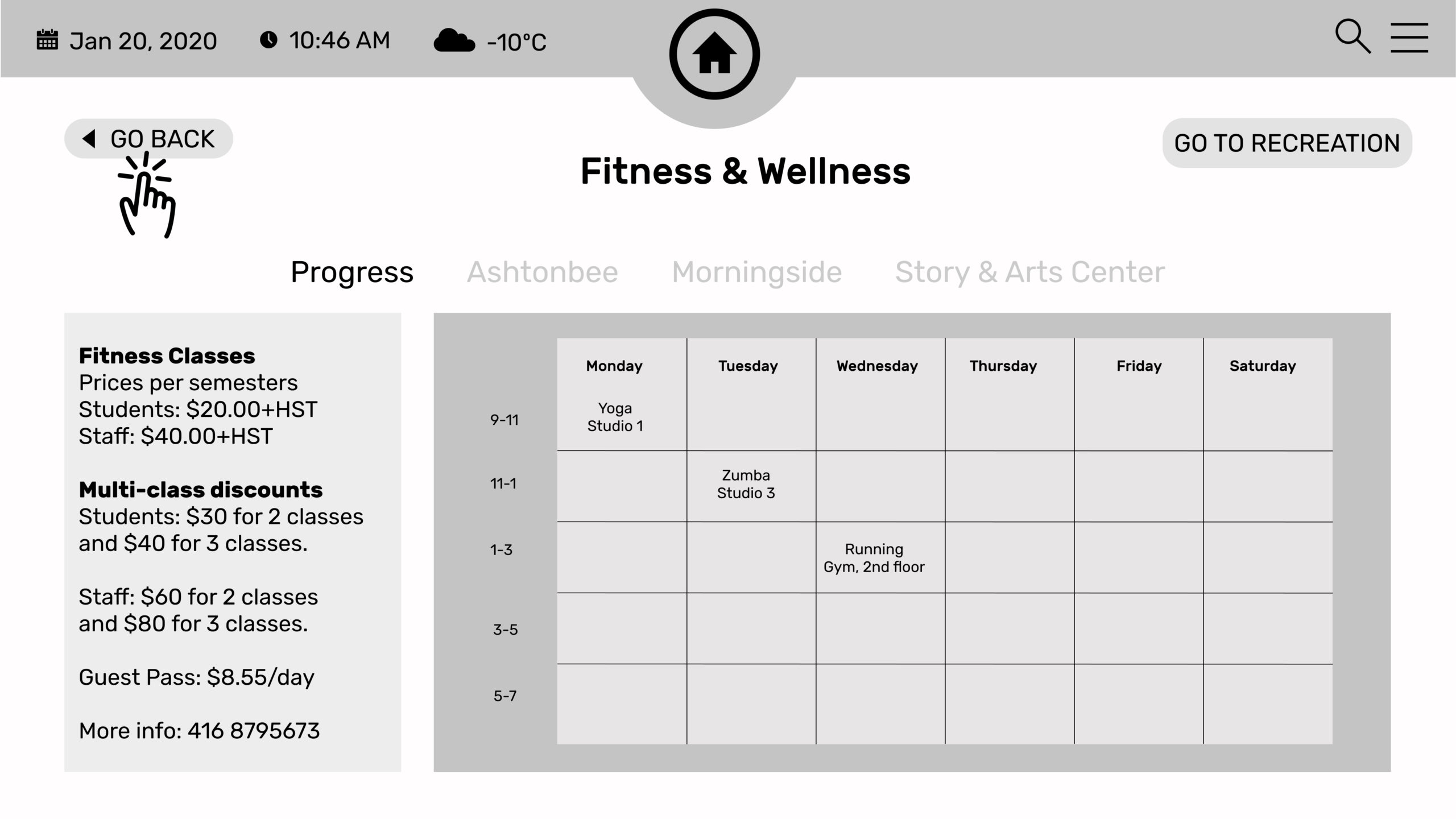
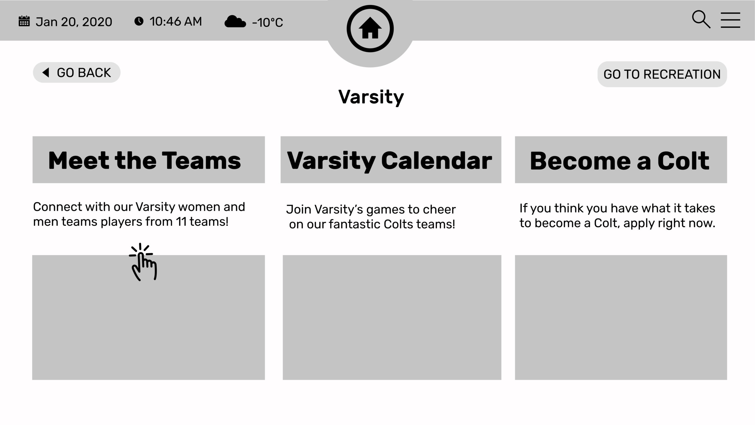
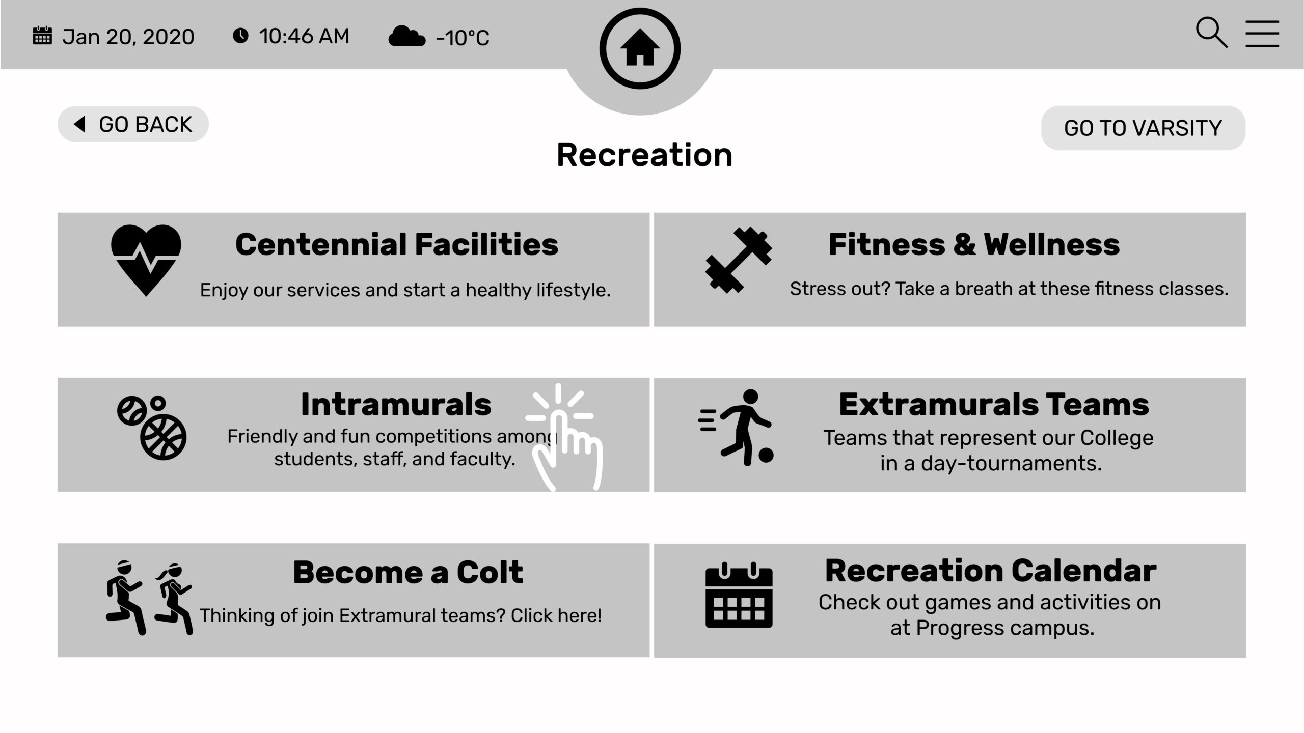
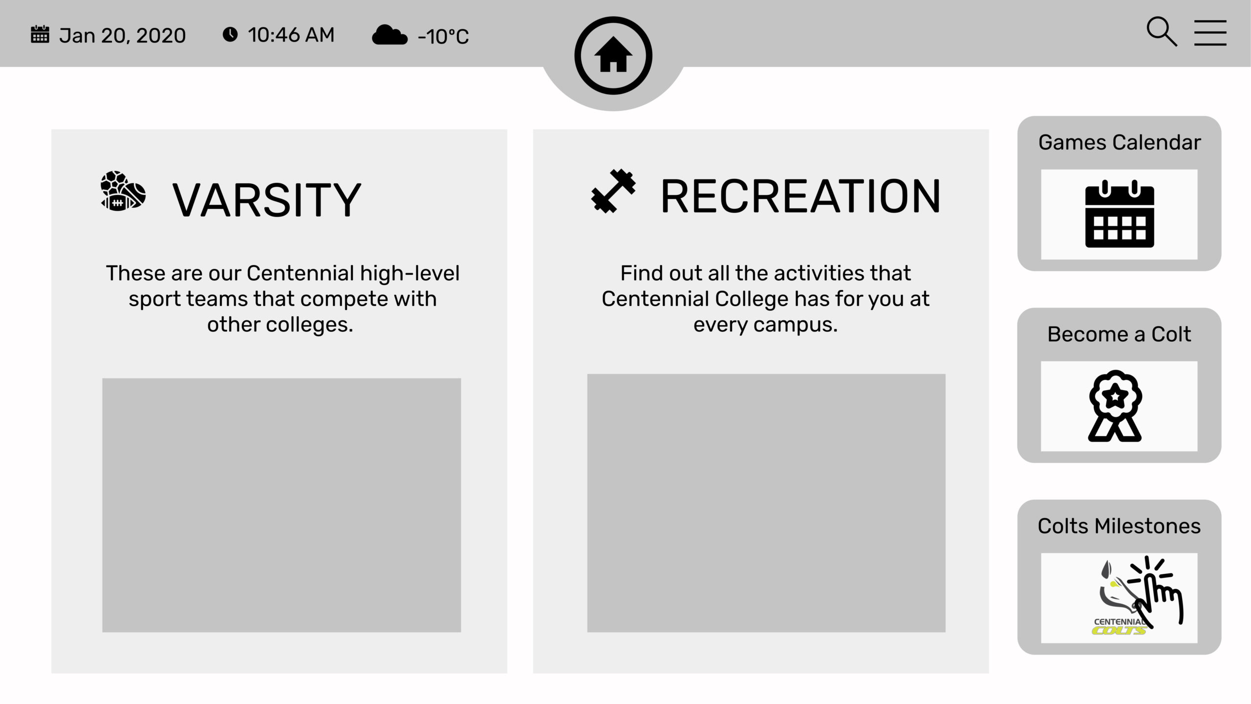
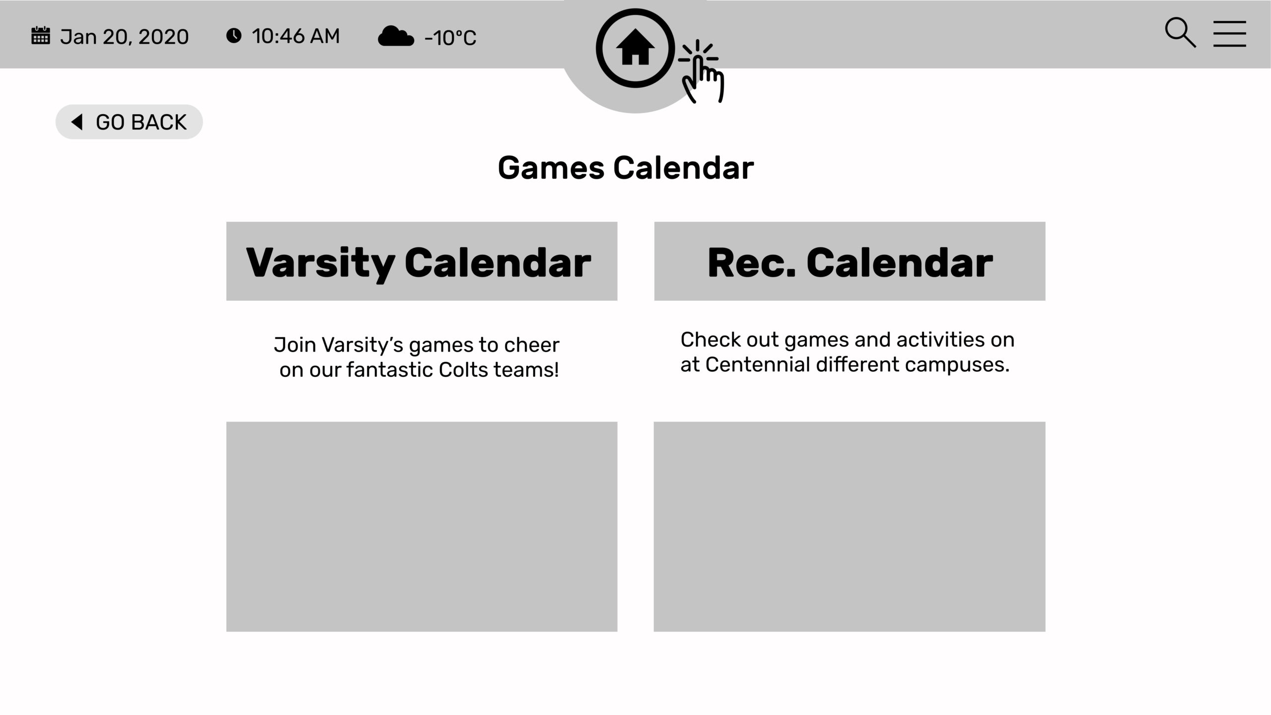
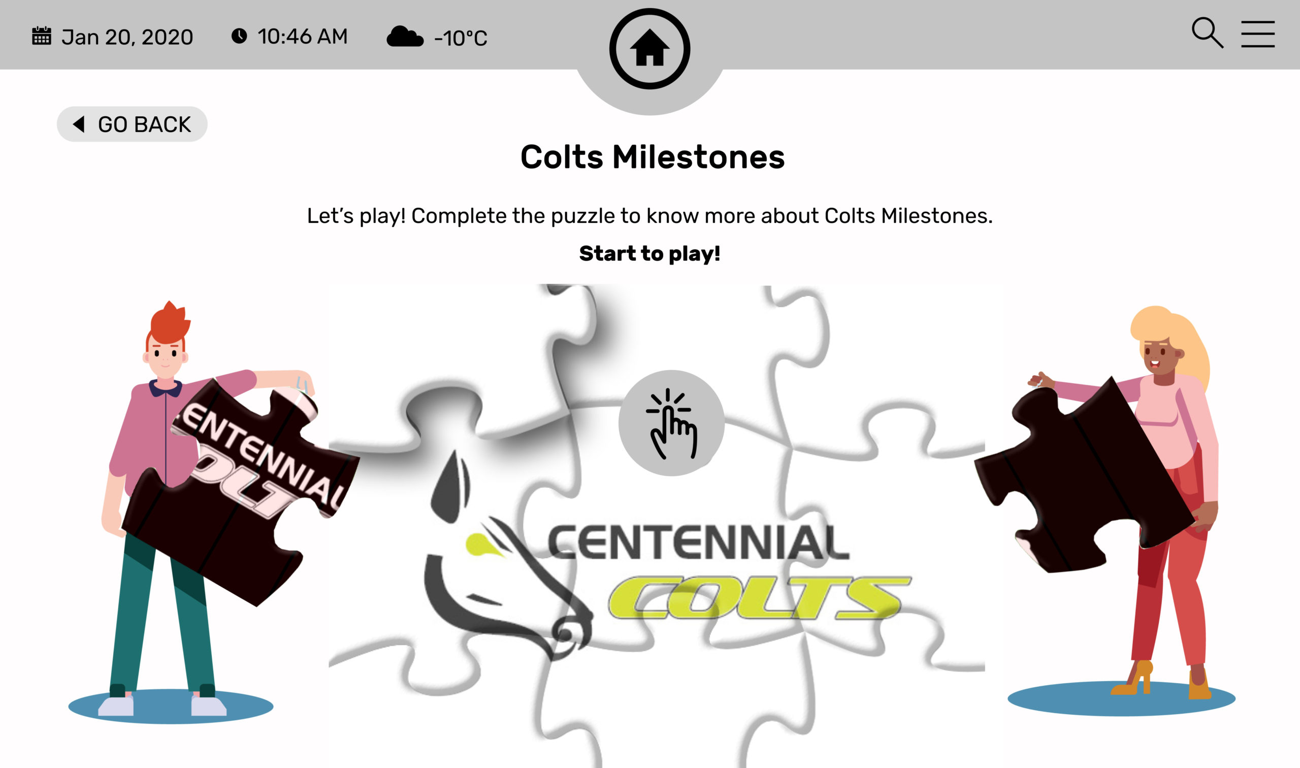
Two UX researchers on our team created a basic layout of 35 screens using Figma. This layout shows how users would move through the platform, the main sections, and the flow of actions. After reviewing and testing it, I began enhancing it.
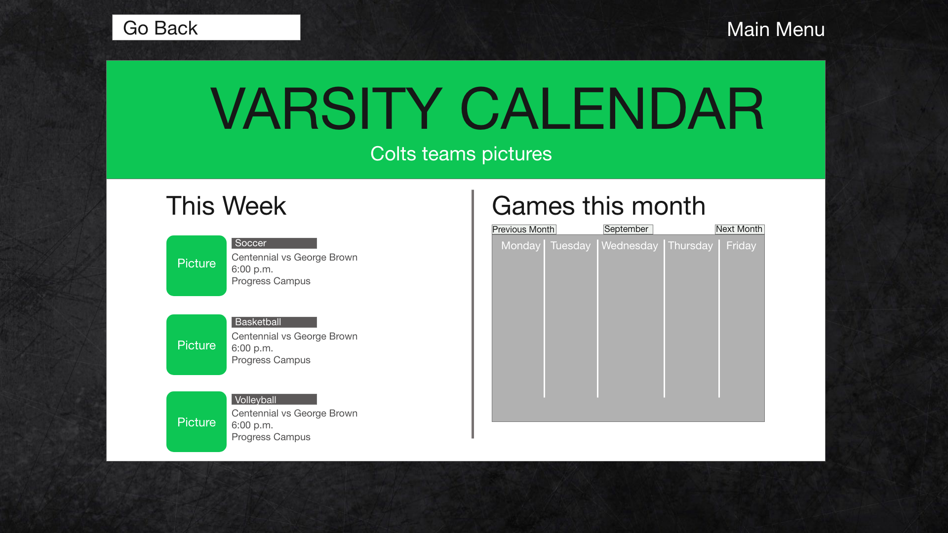
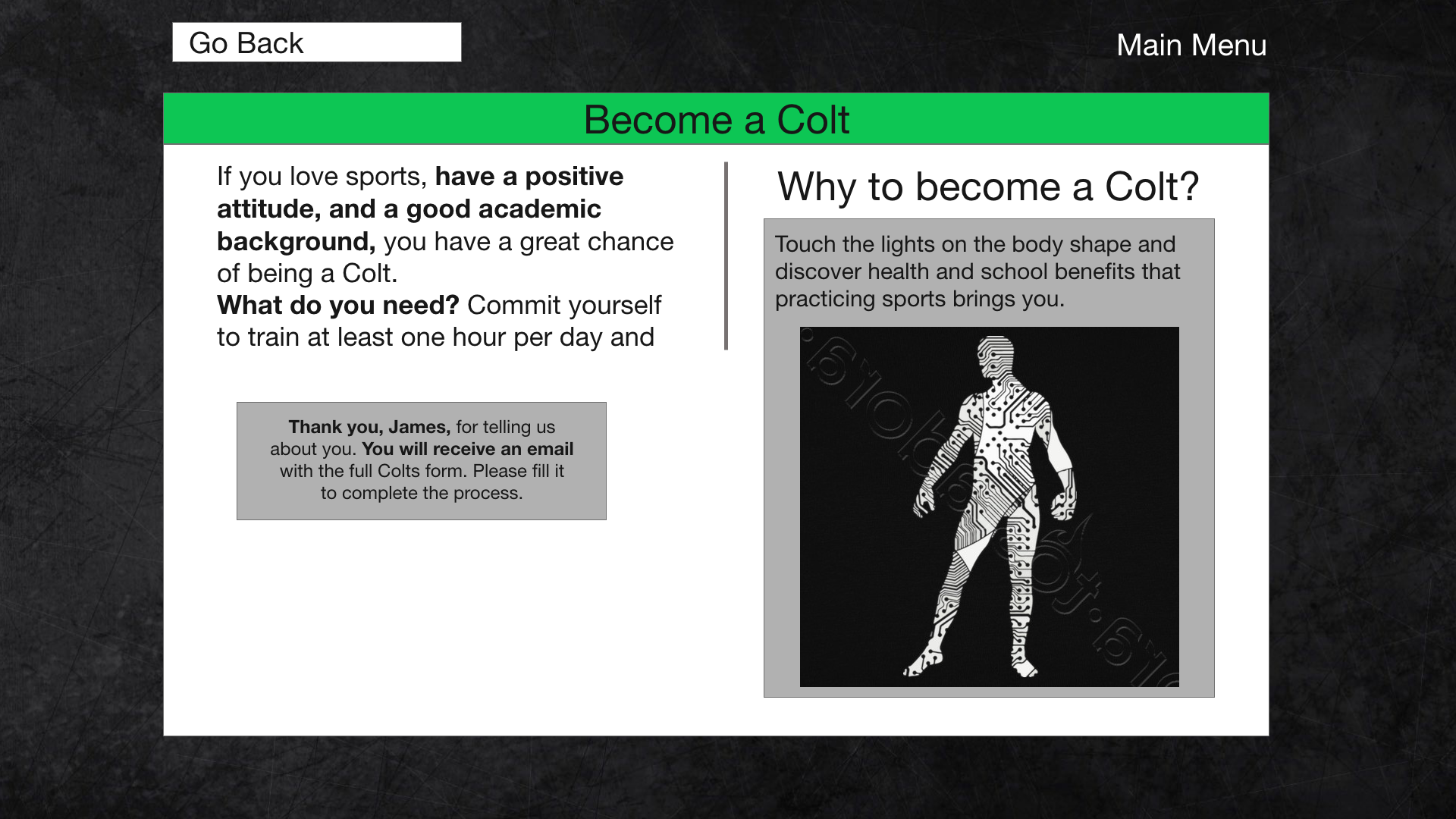
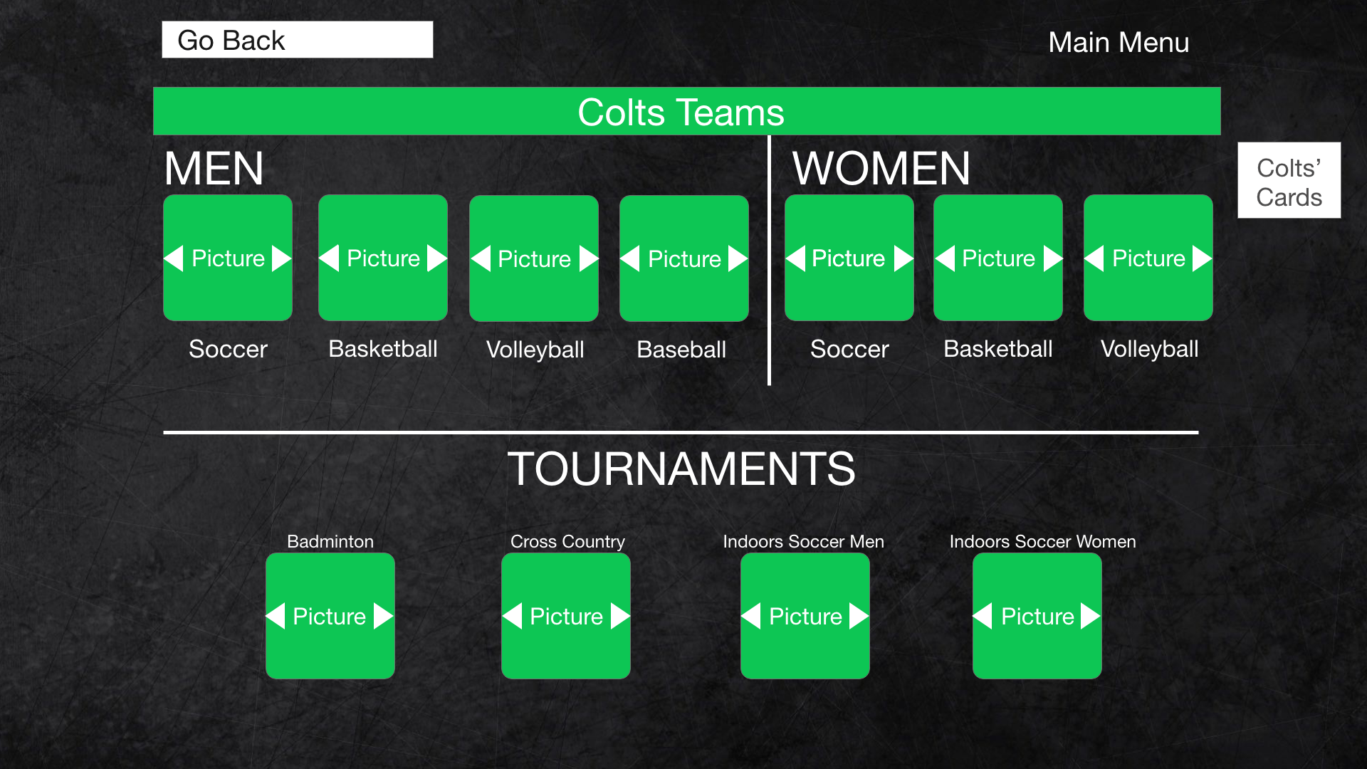
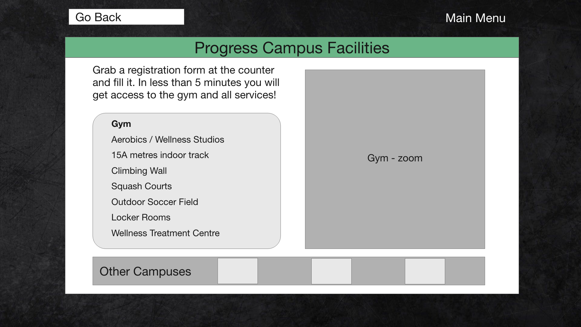
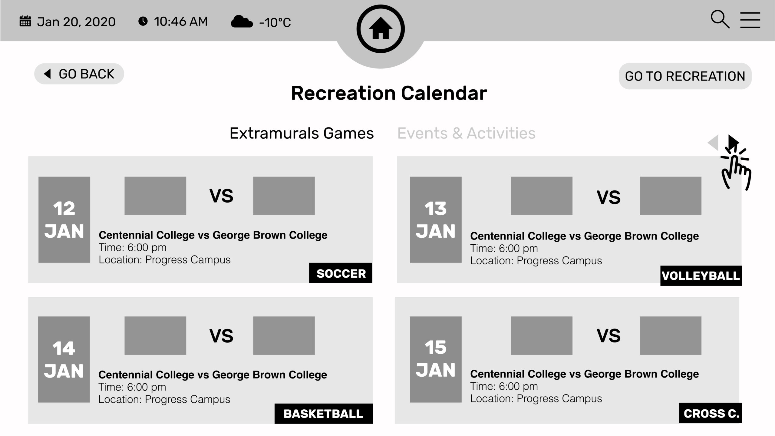
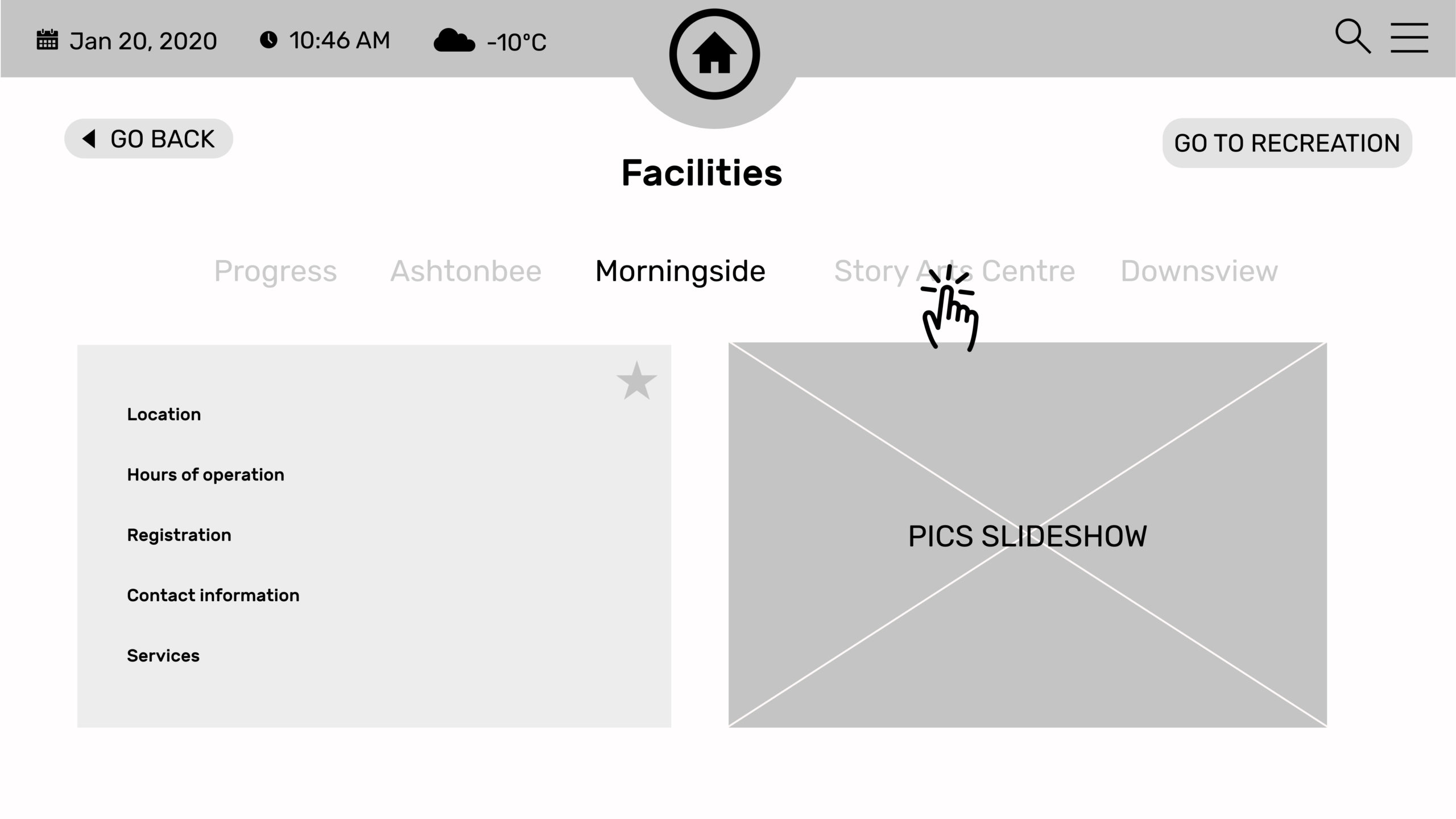
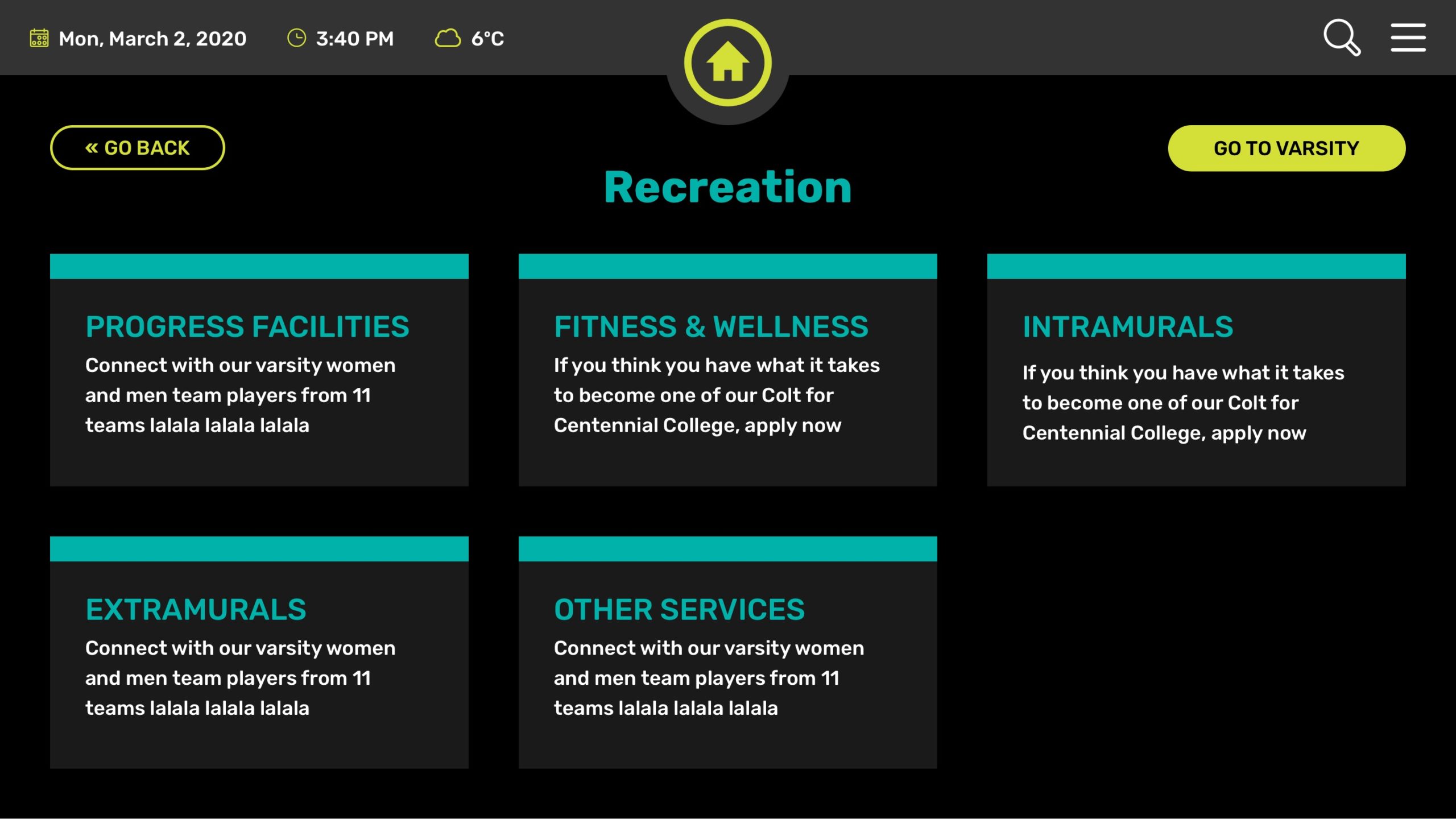
After this, we redesigned the wireframe. One of the first things I noticed was the need for a top navigation menu. When I tested the wireframe, I quickly realized how difficult it was to navigate back and forth. The top bar makes it easier to access everything. Drawing from my experience in website development, I easily understand how frustrating it can be for users to feel lost while navigating.
Additionally, I thought displaying the date, time, and temperature would be beneficial for users checking the games calendar or wellness activities schedule. This way, they wouldn’t need to stop and check their phone or watch; they could simply glance at the screen.
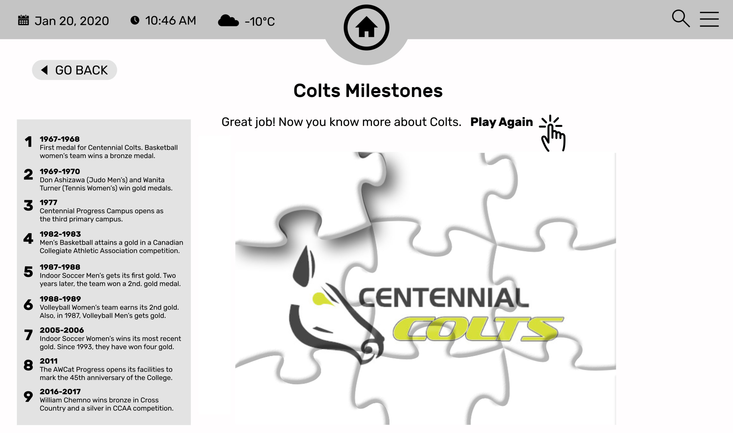
Another idea I proposed was to introduce gamification where possible, adding an extra layer of entertainment to topics that may not be naturally interesting. For example, we included a puzzle game for “Colts History,” which we renamed to “Colts Milestones.”
My ideas were to make things better for users, improve the design, and create a new wireframe with better features.
Designing
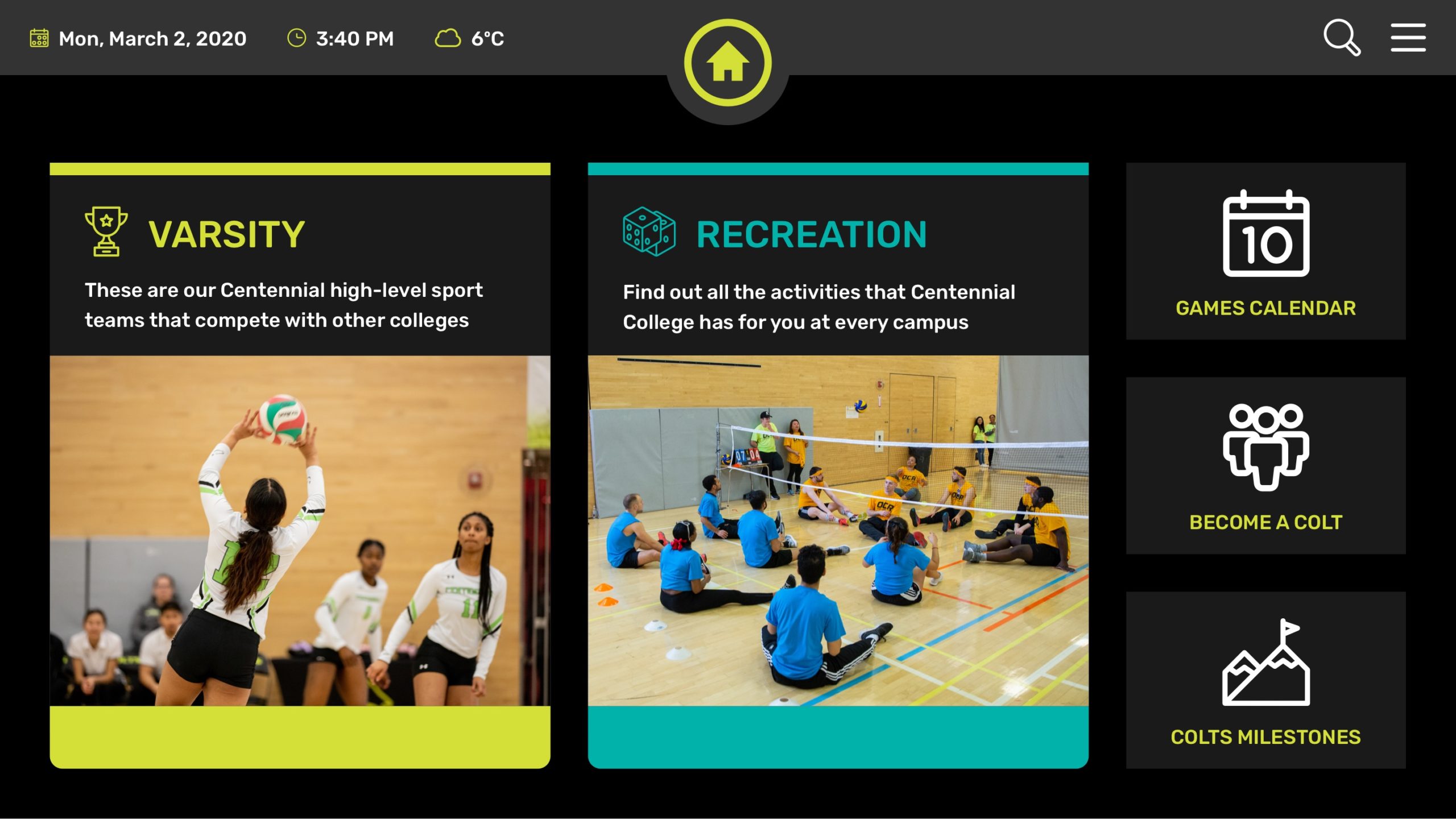
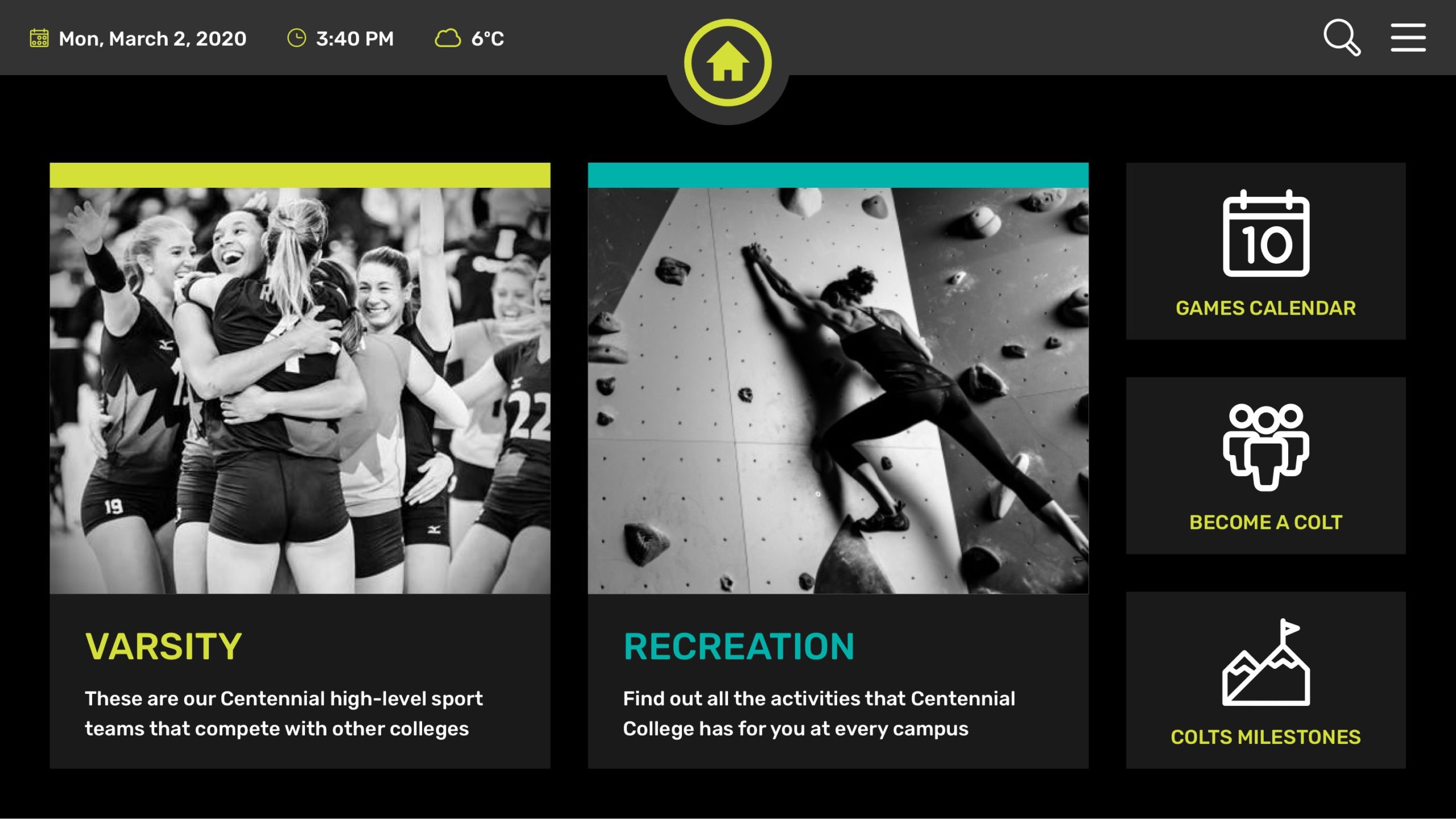
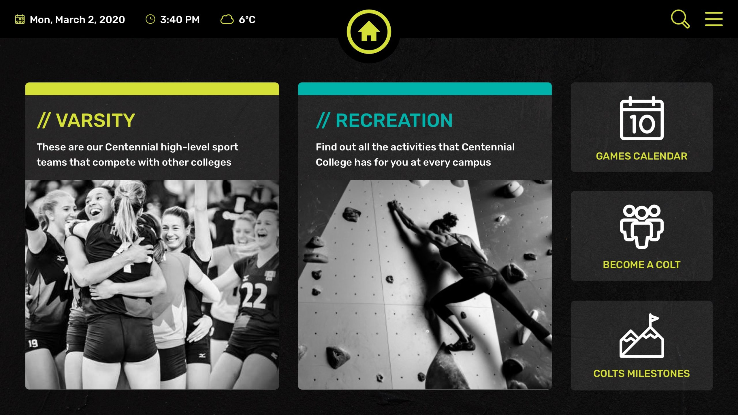
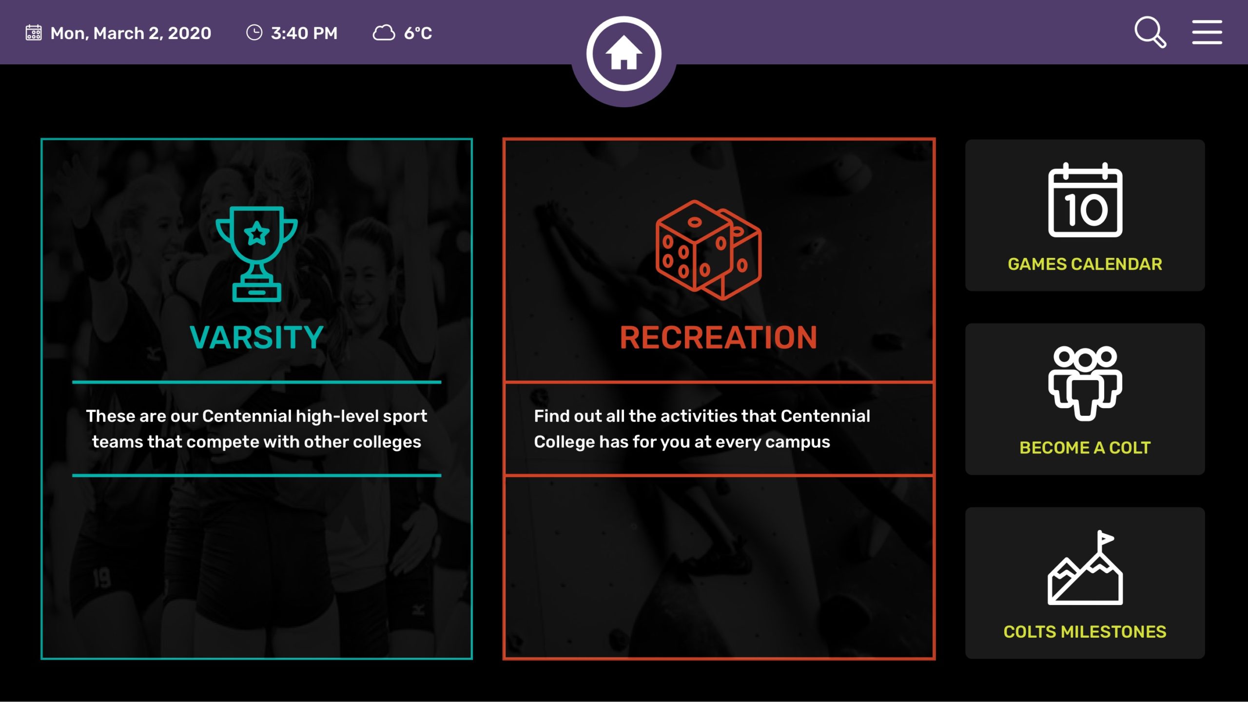
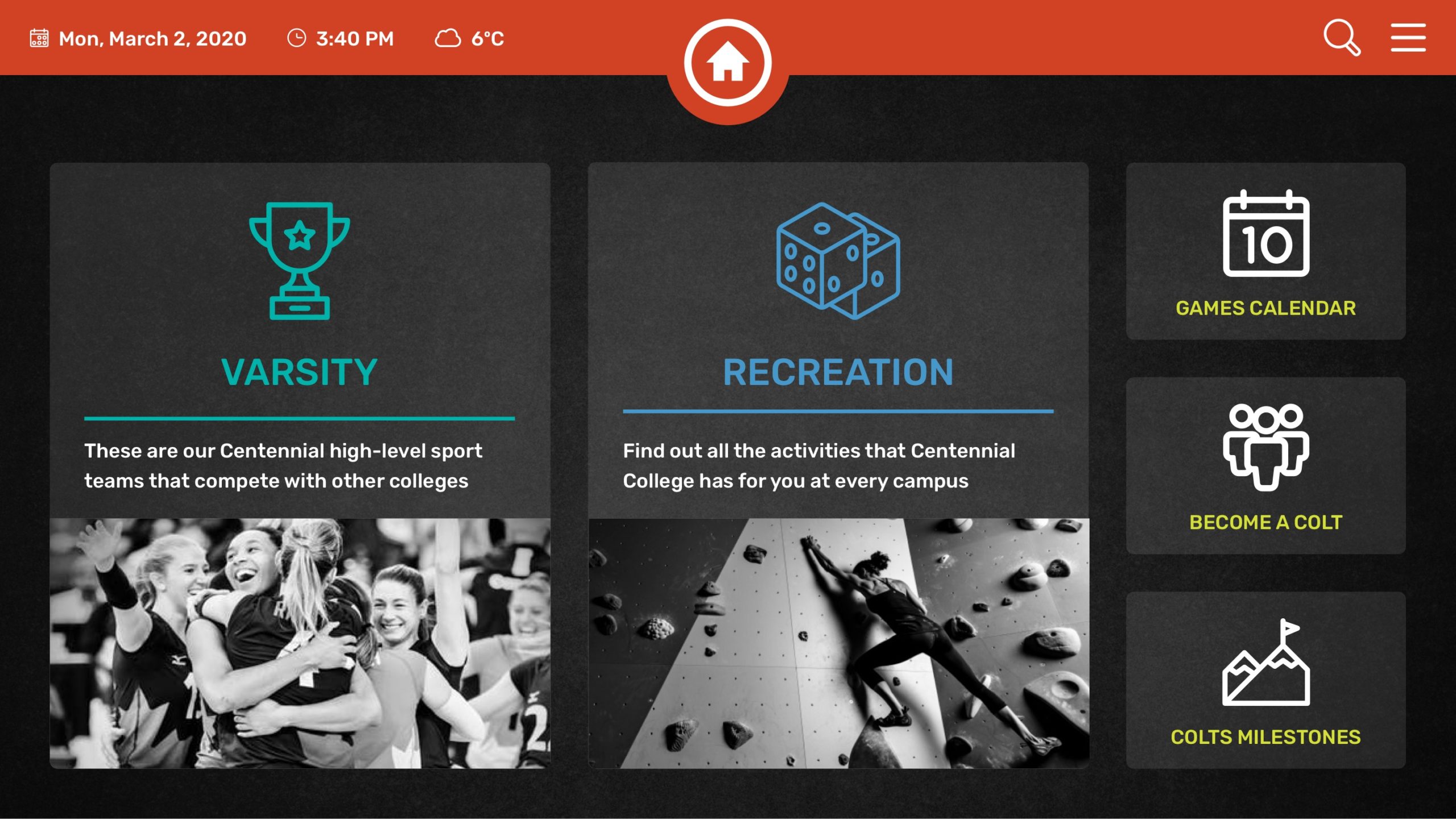
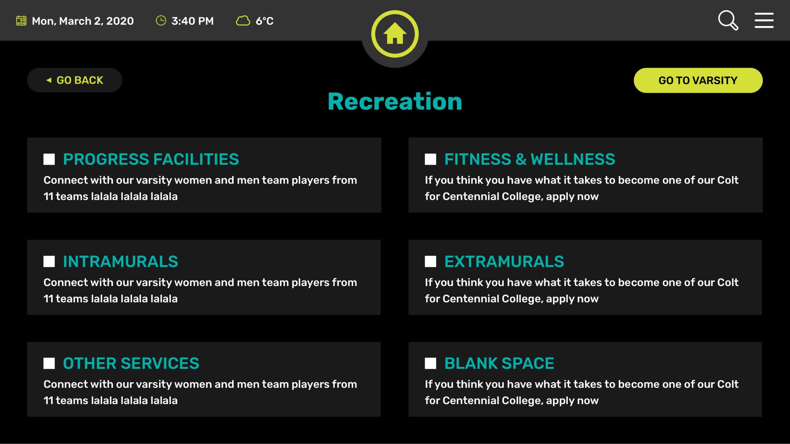
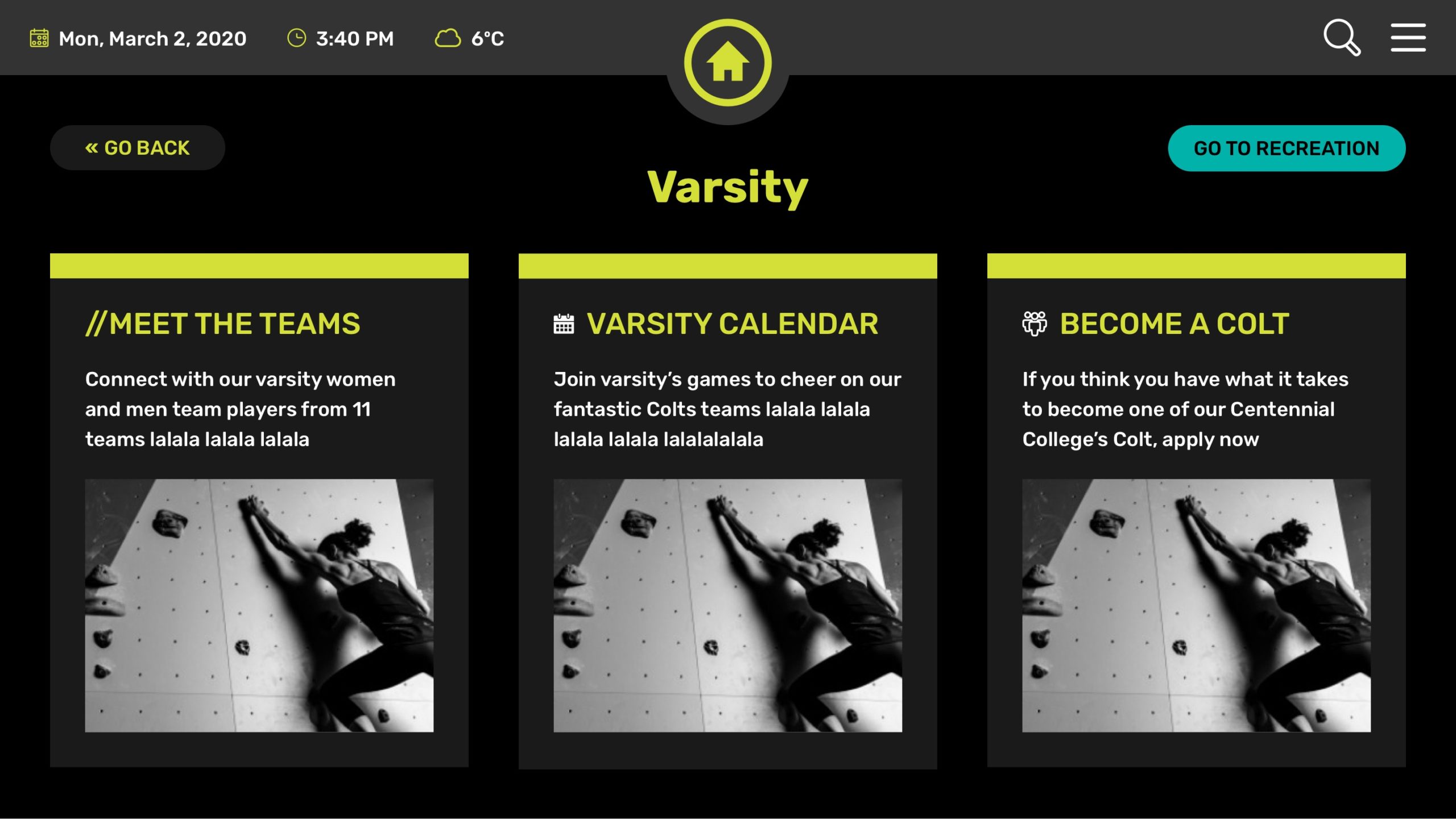
Drawing from the established Colts branding, I created style sheets and experimented with solid and gradient color palettes for the dark mode.
In my creative process, I explored various ways to make the homepage intuitive while maintaining the necessary voice and tone. I suggested using icons because they are universally recognizable and eye-catching. To enhance usability, I recommended using less text and more graphics, which is particularly helpful for people in a rush between classes or during breaks.
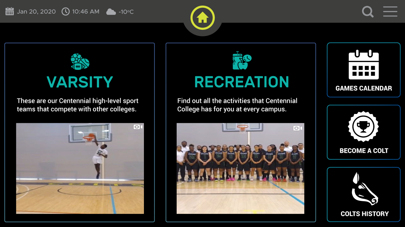
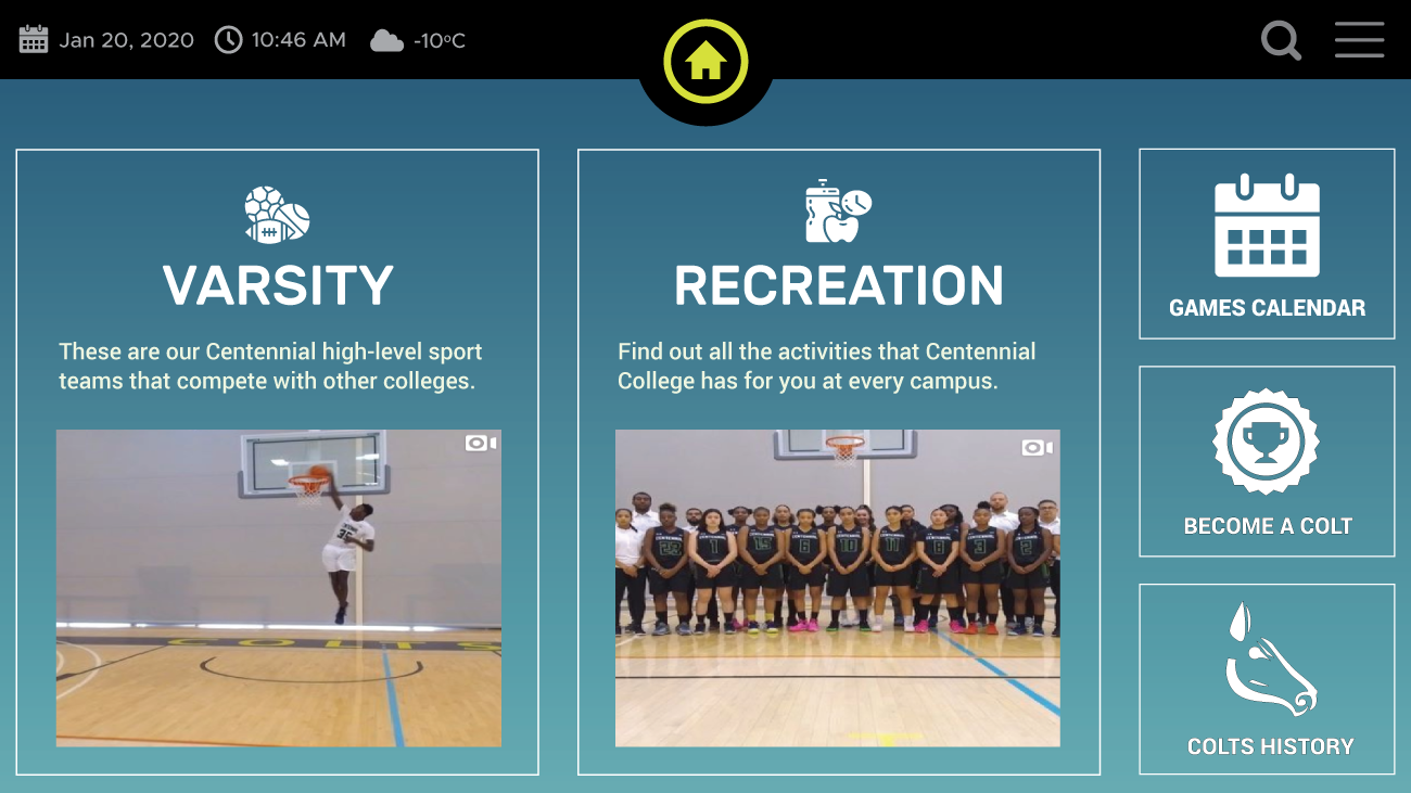
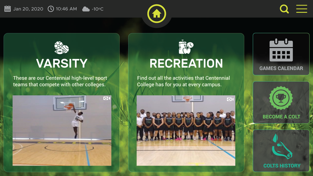
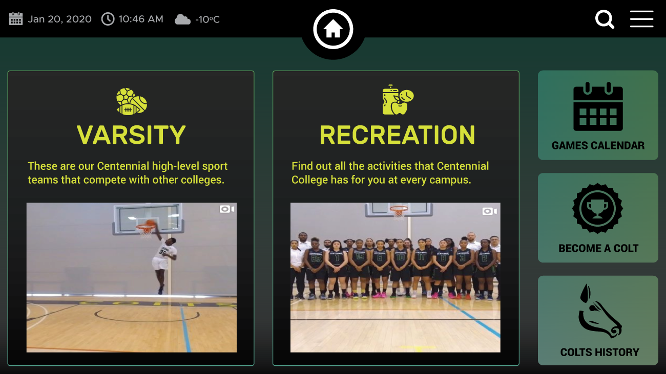
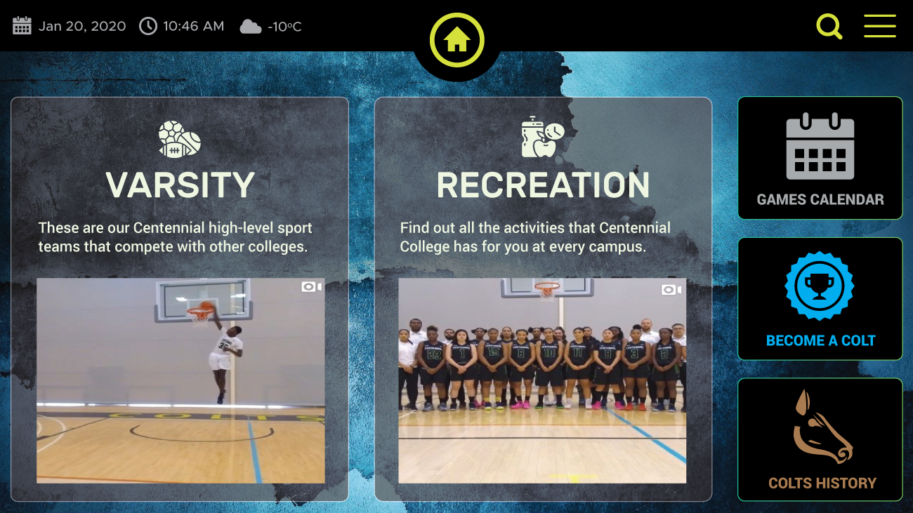
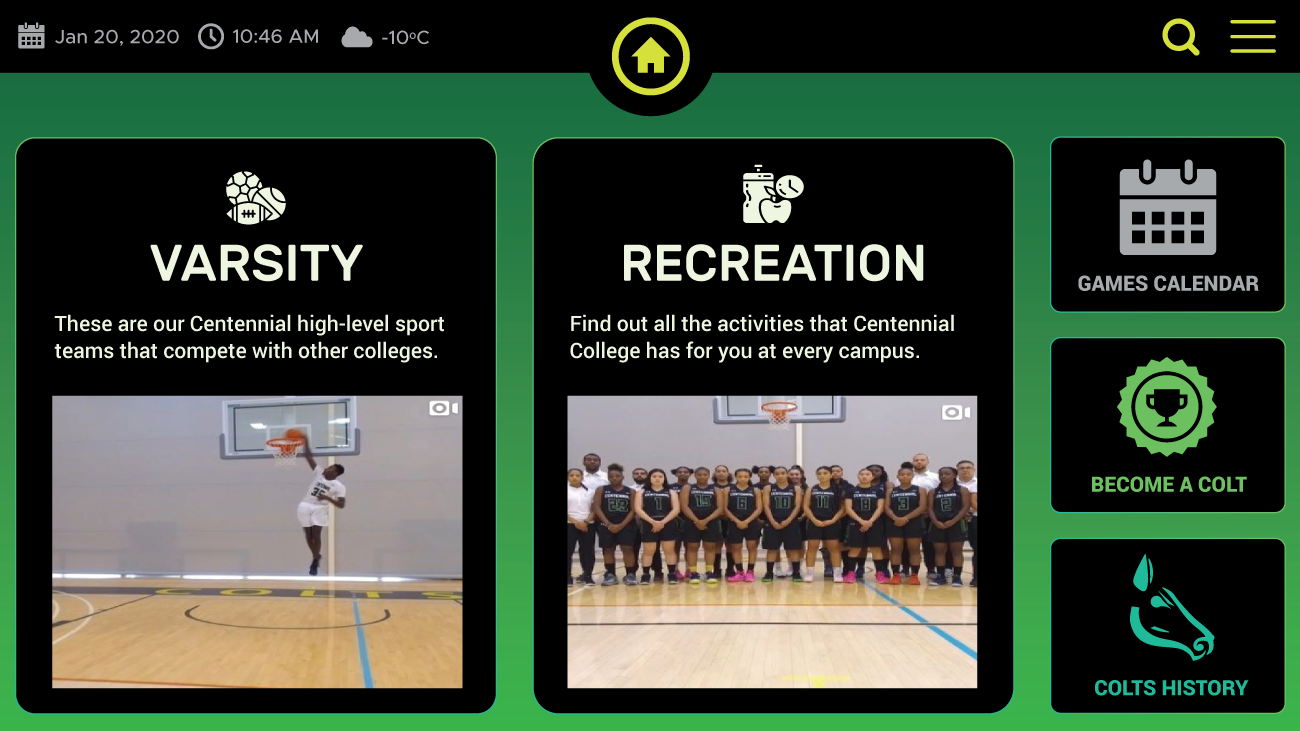
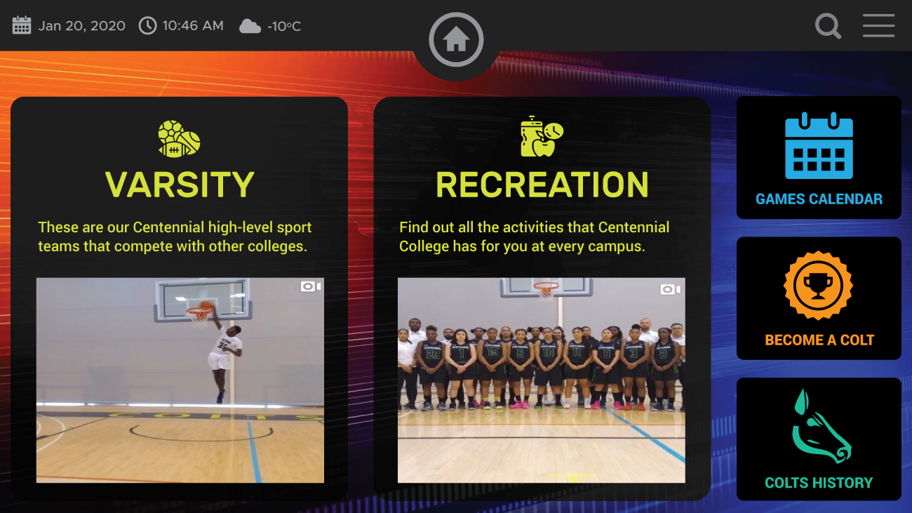
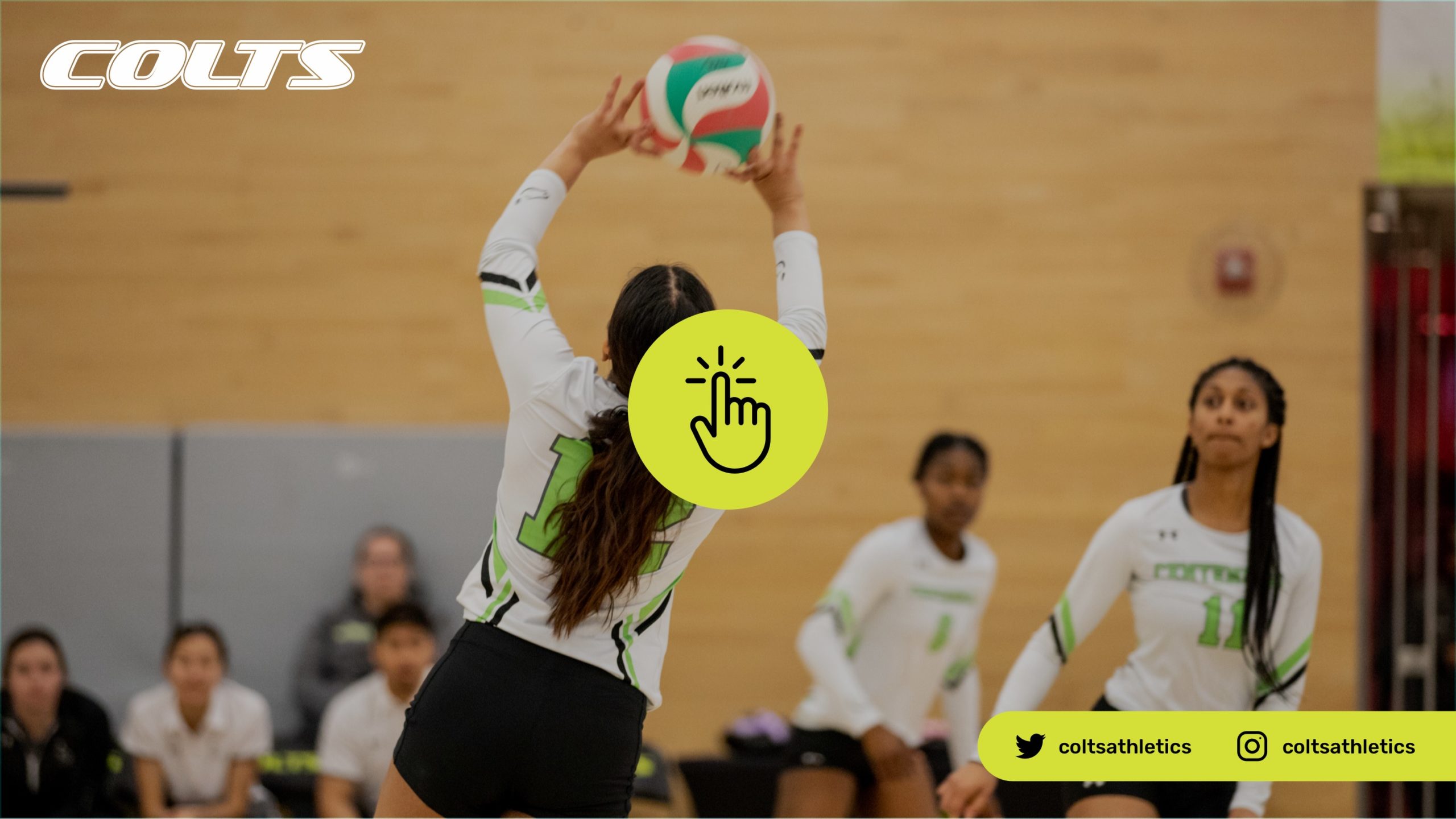
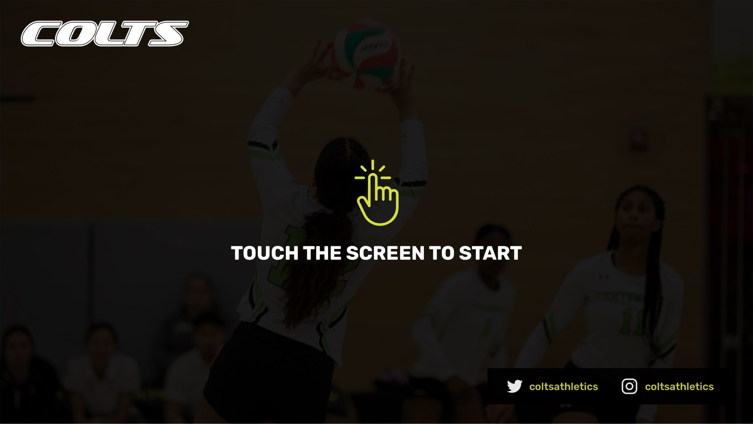
For our initial UI design, our aim was to create design options to determine the layout of elements on the large screen. We understood that all components needed to be smaller with ample white space around them to enhance interaction. However, we chose to first discuss the style guide of the interface and you can see some of our studies below.
My Learning and Takeaways
This project began in late 2019 but was paused in 2020 due to the pandemic, leading to the closure of all sports and wellness facilities at Centennial College and the cancellation of all games. Part-time employees, including myself, started working from home and were eventually laid off in April 2020.
Working on this project as a UX/UI designer was a rewarding learning opportunity. Designing an interface for a large screen from scratch was a fascinating challenge.
If I were to continue working on this project, I would conduct more user testing, including:
- Usability Testing: This would involve observing how users interact with the touchscreen in a real-world setting to identify any usability issues and gather feedback for improvement.
- Accessibility Evaluation: I would evaluate the touchscreen for accessibility standards, such as those outlined in the Web Content Accessibility Guidelines (WCAG), to ensure it can be used by individuals with disabilities.
Additionally, more meetings with the software company, especially with one of the developers, would be necessary. We would need to send them our prototype to gather feedback on technical details and limitations, such as the issues with the “send a cart” feature, which was removed earlier in the process.