UI DESIGN
The Formula
Purposeful user infertace and visual concept for The Formula's e-commerce
About the project
Summary
My Role
Lead Designer
Team
Marketing Specialist
Website Developer
Agency
Be Responsive Media
Tools
Adobe XD
Adobe Illustrator
Adobe Photoshop
Deliverables
Shopify customized design
Visual concept
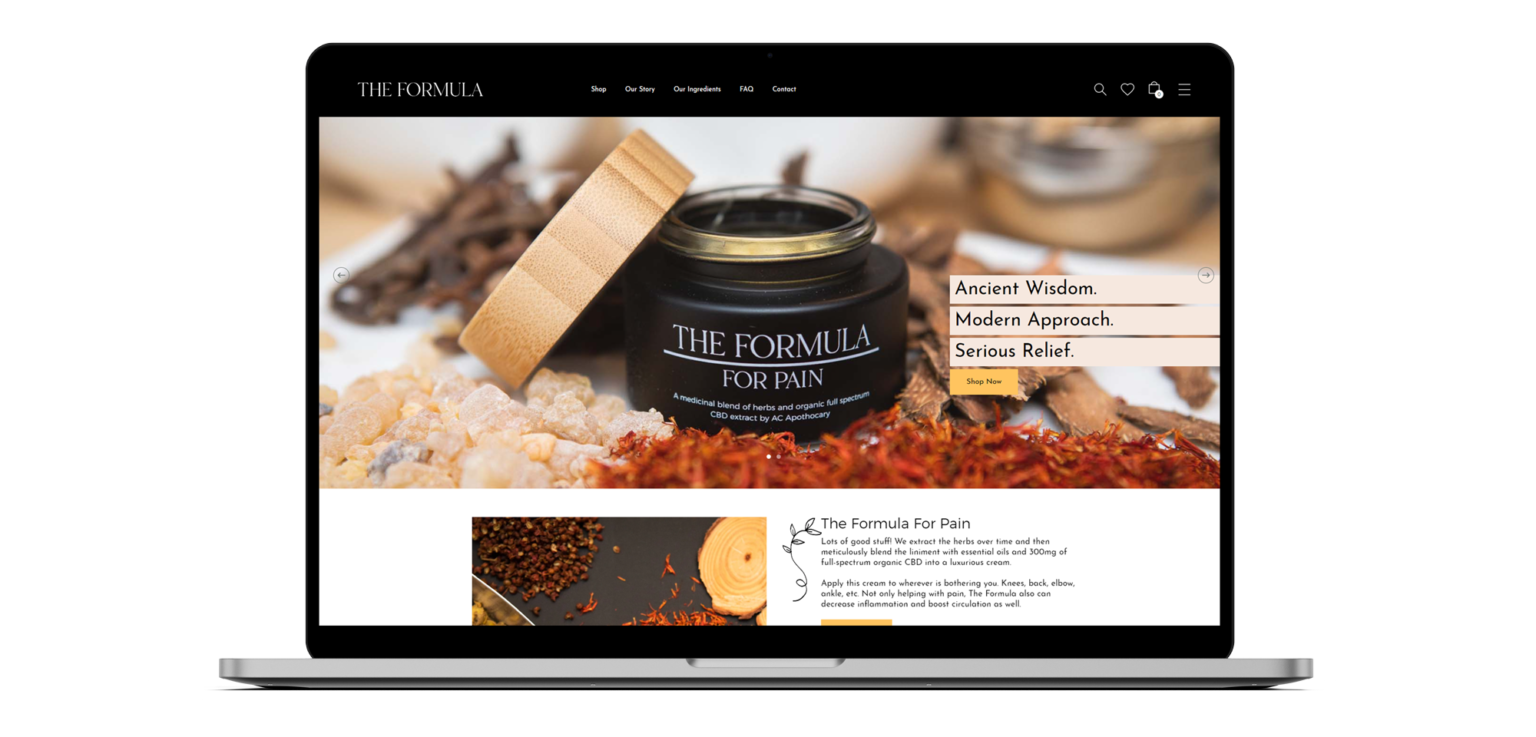
The client wanted to sell skin products online, so our agency built their new e-commerce site. I played a crucial role as the lead designer and main point of contact with the client.
They required a comprehensive interface and visual elements, such as color schemes, typography choices, and overall aesthetic, to establish a cohesive look and feel for the new brand.
Problem
The Formula, a new skincare brand from the Acupuncture Center in Basking Ridge, NJ, has developed a natural, luxurious pain-relief cream and spray for sale at their clinic and online in the US.
However, their current sales strategy relies solely on emails and in-clinic sales, limiting their customer reach. They’re missing out on the opportunity to sell directly online, which hampers their ability to reach a wider audience.
Additionally, the brand’s visual identity is limited to a simple logo, lacking other visual elements or a cohesive brand identity.
Opportunity
Shopify is the ideal e-commerce platform for this project because it supports merchants who want to sell products containing Organic Full Spectrum Cannabidiol (CBD) in the US.
As the Lead Designer, I wanted to make sure our brand stood out and that our website was easy to use. I focused on making the website work well on phones so that people could find what they needed easily. I also made sure that buying things on the website was fast and simple.
My Process
Kickoff Meeting
I started by meeting with my team to discuss the project’s scope and understand all its aspects. I was responsible for knowing the project’s cost, timeline, and what we needed to deliver. I also took the lead in communicating with the client to keep them informed, conduct design review sessions, and obtain feedback and approvals.
Understanding client’s expectations for the design
The client wanted their brand to feel luxurious and natural, appealing to a more mature audience. They preferred not to use obvious green shades, steering away from the typical look of CBD products.
Research on Shopify
This project was a great learning opportunity for the team as we built a customized e-commerce site using Shopify. I conducted research to find suitable themes to guide our developer, though some pages were created from scratch.
Research on Competitors
To inform our user interface design, I researched the competitors online to understand their style for similar CBD products.
Wireframing
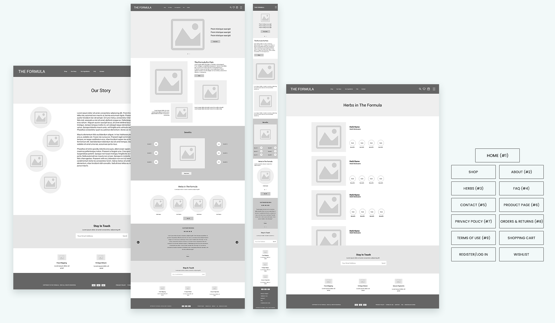
After meeting with the client to align expectations, I began by creating a homepage layout base for the developer. Following internal discussions and presenting various options to the client, they chose the layout that best suited their business.
The sitemap covers the homepage and all internal pages of the store. For this project, our developer customized most of the pages based on the user interface design I created in Adobe XD.
Designing Visual Identity
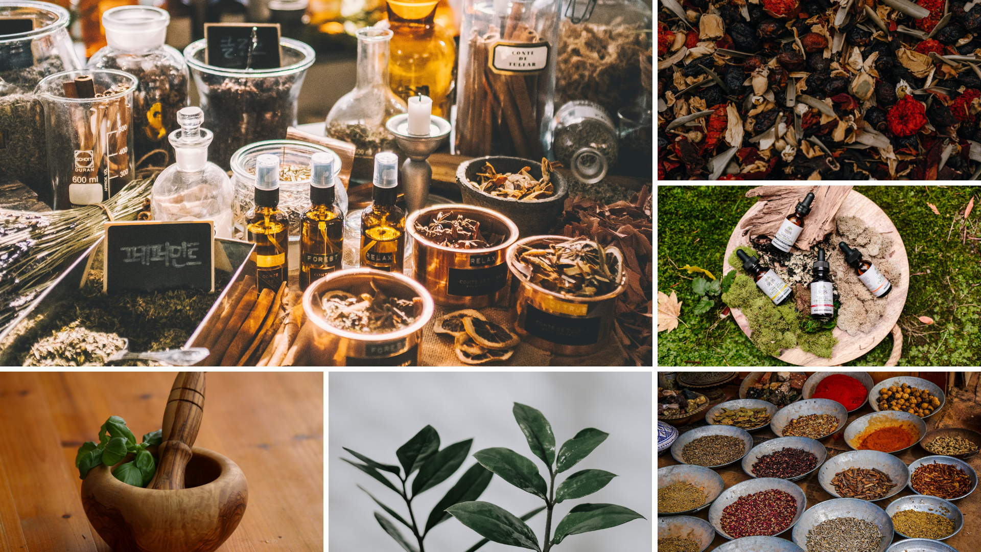
Next, I delved into defining the visual identity for this exciting new brand. This brand isn’t just about products; it embodies a holistic approach to pain relief, blending all-natural medicinal herbs and organic ingredients.
To capture this essence, I created a mood board that paints a vivid picture of the brand’s identity. It’s a rich tapestry of earthy tones and textures, showcasing botanical wonders, custom herbal formulas, compounded remedies, and the pure essence of natural herbal goodness. Each element was carefully chosen to evoke a sense of wellness, healing, and the nurturing power of nature.
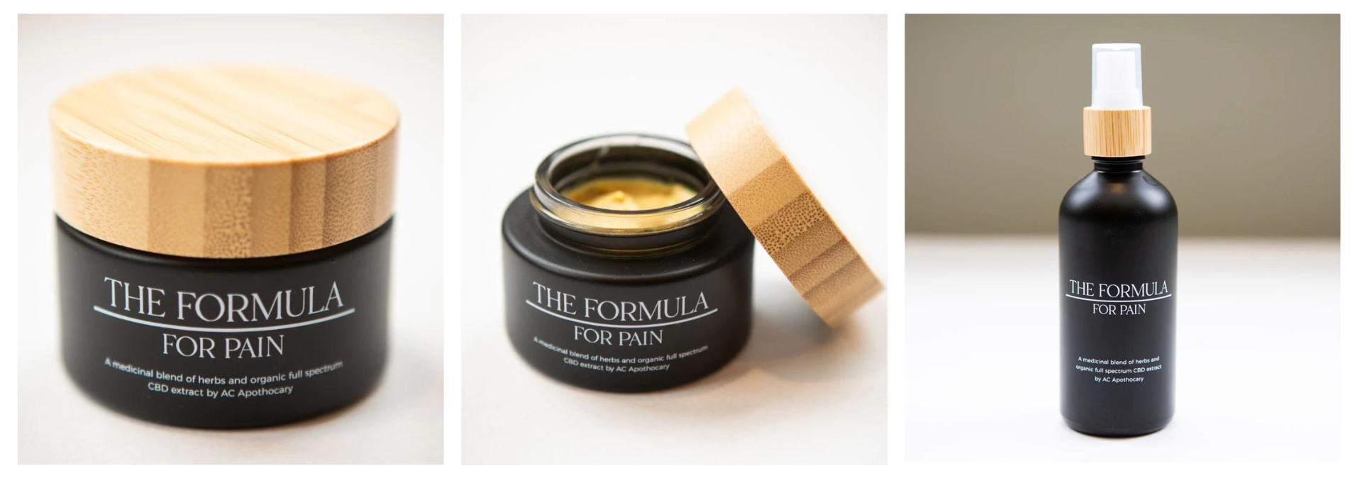
The packaging design is more than just a container; it’s a testament to nature’s healing touch. It’s crafted to exude a natural, earthy feel, featuring prominent wood elements and a crisp white logo set against a bold black background. While CBD is a secondary element, it’s subtly incorporated to underscore the product’s unique selling point.
These packages were my guide throughout the entire branding identity design process.
Considering users
Crafting a user need statement helped me to step into Anna’s (persona) shoes and understand her daily challenges:
Meet Anna, a dedicated nurse in her fourth month of pregnancy. Her days are long and demanding, often leaving her with persistent lower back pain. Seeking relief, Anna looks for a topical treatment to soothe her discomfort every evening, longing to feel refreshed and at ease when she finally returns home after her demanding shifts.
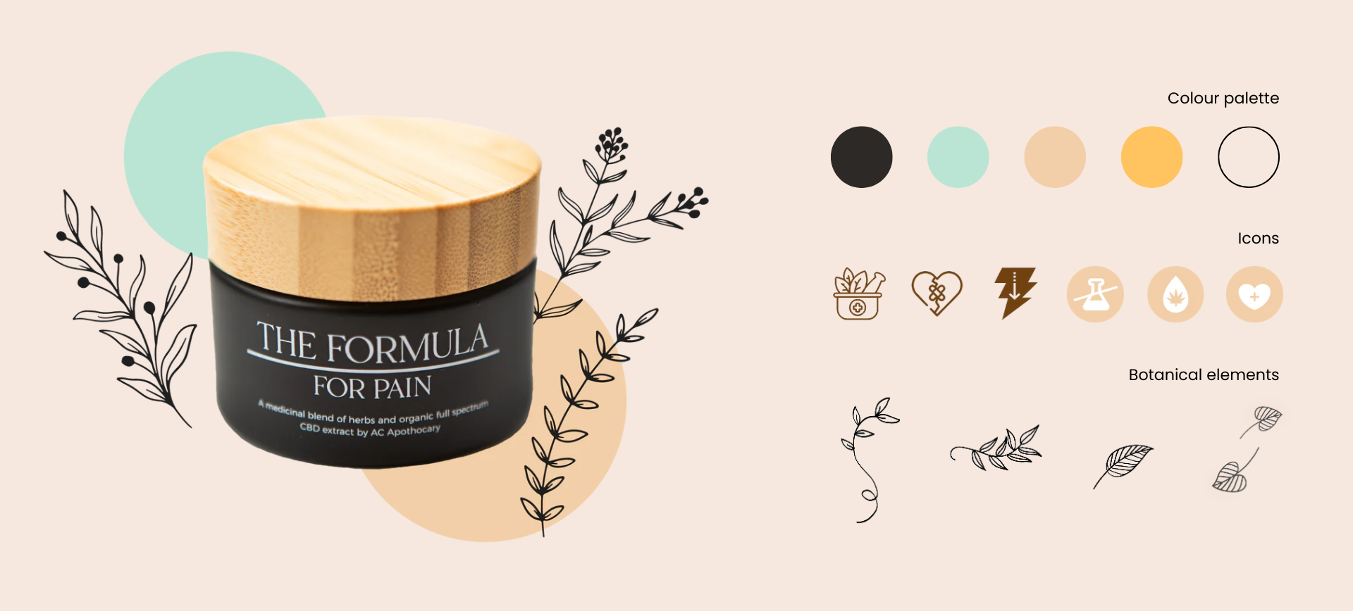
I curated a comprehensive collection of visual elements that not only met the immediate needs of the project but also provided a versatile toolkit for the client’s ongoing design communication. This collection included a range of assets such as color palettes, typography styles, iconography, patterns, and imagery guidelines. These elements were carefully selected to reflect the brand’s identity and values, ensuring consistency and coherence across all design materials.
The client was thrilled with the collection, as it not only empowered them to replicate the designs effectively but also inspired them to explore new creative directions in their future communications.
Design concepts
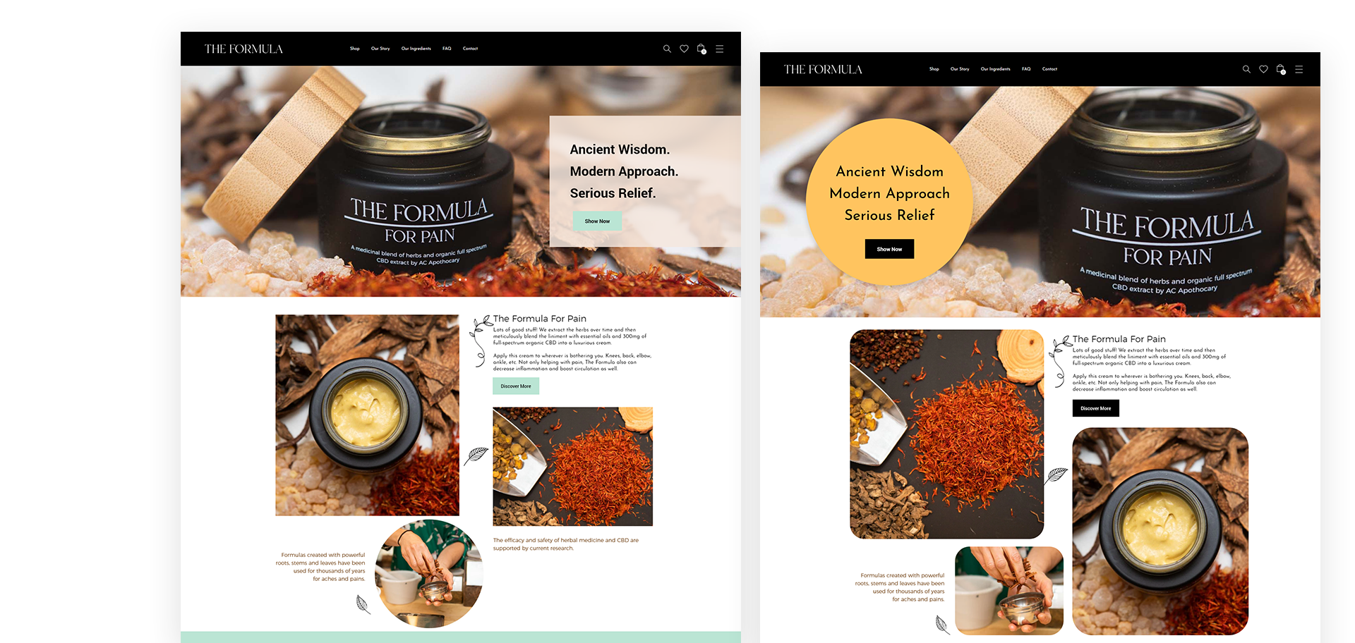
After the wireframe was approved, I started designing concepts for the homepage. I chose accent colors for the CTA buttons to make them stand out and added immersive visual elements to create a unique emotional experience.
The store is easy to navigate. Visitors can easily go from the homepage to the product page or the page with all the products for sale.
In a design review session, I presented the design concepts to the client, and they felt we were heading in the right direction.
Final user interface
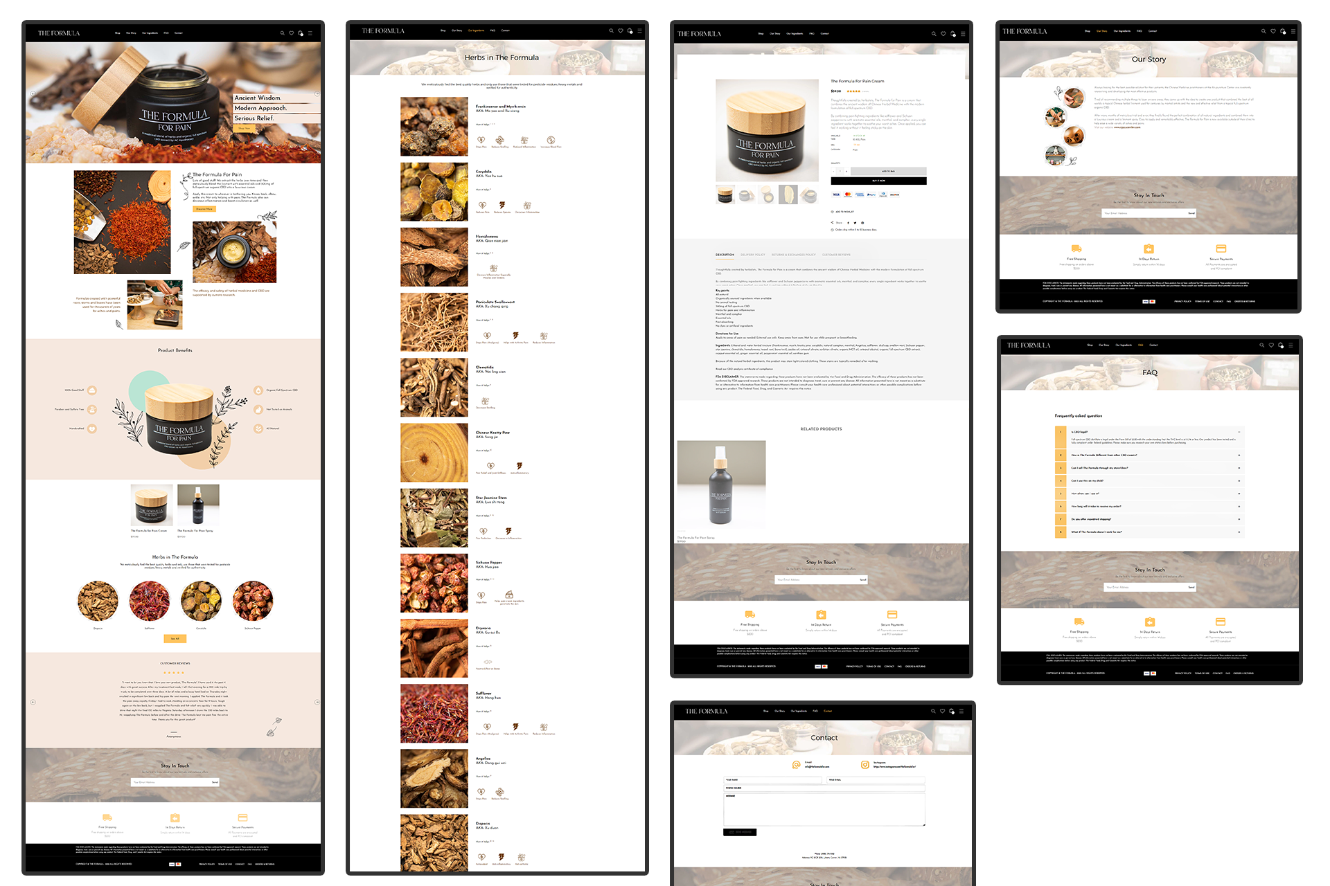
After fine-tuning the design and thoroughly testing all pages and functionalities of the website, we ensured that every aspect met our high standards for performance and user experience.
The design of the additional visuals and brand identity elements is not only beautiful but also perfectly aligned with the brand and its products.
Learning and Takeaways
During this project, I was aware of the budget and timeline. I learned to manage my time better so the developer had more time to work. This project was a learning experience for both of us. He had no prior experience with the Liquid language, which is an open-source template language created by Shopify and written in Ruby. I needed to familiarize myself with the platform’s limitations and requirements to have a good sense of what could be achieved within our timeframe and what was not a priority.
At the end of the day, the client was extremely pleased with my work, which was very motivating for me. They appreciated the visual elements I created and began incorporating the same colors, images, and patterns into their social media posts.
We faced a challenge with the payment method, which couldn’t process CBD product purchases. My team and I had to spend extra time researching another option for the client and setting it up.
There are restrictions on selling this product outside of the state. We conducted research on this during the discovery phase of the project, but there were also bureaucratic documents that the client needed to provide. We supported them in solving these problems to make the store fully functional.
This store made its first sale in the first week of launching, which aligned with the client’s expectations.